As the face of Caruccio’s, Lisa Caruccio explained why she chose Suzanne Zahr to work on her brand identity in addition to designing the physical space: “My intuition that I liked and trusted Suzanne led me to use her for other areas and be my one point of contact, which streamlined many things. We collaborated well together, and there was no question to go with her because she understood what I wanted (and didn't want) very well. [We have] a mutual respect.”
This mutual respect also comes from Suzanne’s ability to understand how Lisa’s backstory plays into her dream and vision of Caruccio’s. Coming up with the brand identity for Caruccio’s took many rounds of edits, countless discussions, and lots of brainstorming. Refusing to settle, they passed along many ideas that didn’t click or resonate with Lisa and her personal goals for Caruccio’s.

This intense process included a lot of interdisciplinary collaboration, and the brainstorming table included Lisa, Suzanne, Gary Henderson of Gary Henderson Interiors, and Creative Director Laurent Bourscheidt of L+B Design. As a team, they were able to decide on brand guidelines, the logomark, and a tagline that fit with Lisa’s vision.
Everything in the Caruccio's business plan fell into three different categories: “Learn” for the classes and culinary experiences, “Mingle” for the events side of the business, and “Share” for the space where the community can come in and make the space their own. The combination of the three words had a nice ring to it, so the creative team decided that “Learn. Mingle. Share.” was the right tagline for Caruccio’s.
In the brand guidelines, they outlined the personality of Caruccio’s and decided that the brand should give off a vibe of being elegant, welcoming, caring, and accessible. The color scheme naturally rose from the personality as well as their interior palette, with gold to represent high quality, expertise, and timelessness, and blue as a contrast color to capture the “magic hour” of nighttime and a vibrant feeling. Both together appear to be like twinkling gold stars in the night sky and rich with life. These brand guidelines became a touchstone for ensuring consistency between all of the efforts that went into the brand identity, including the marketing collateral, the web design, and the logomark for Caruccio’s.

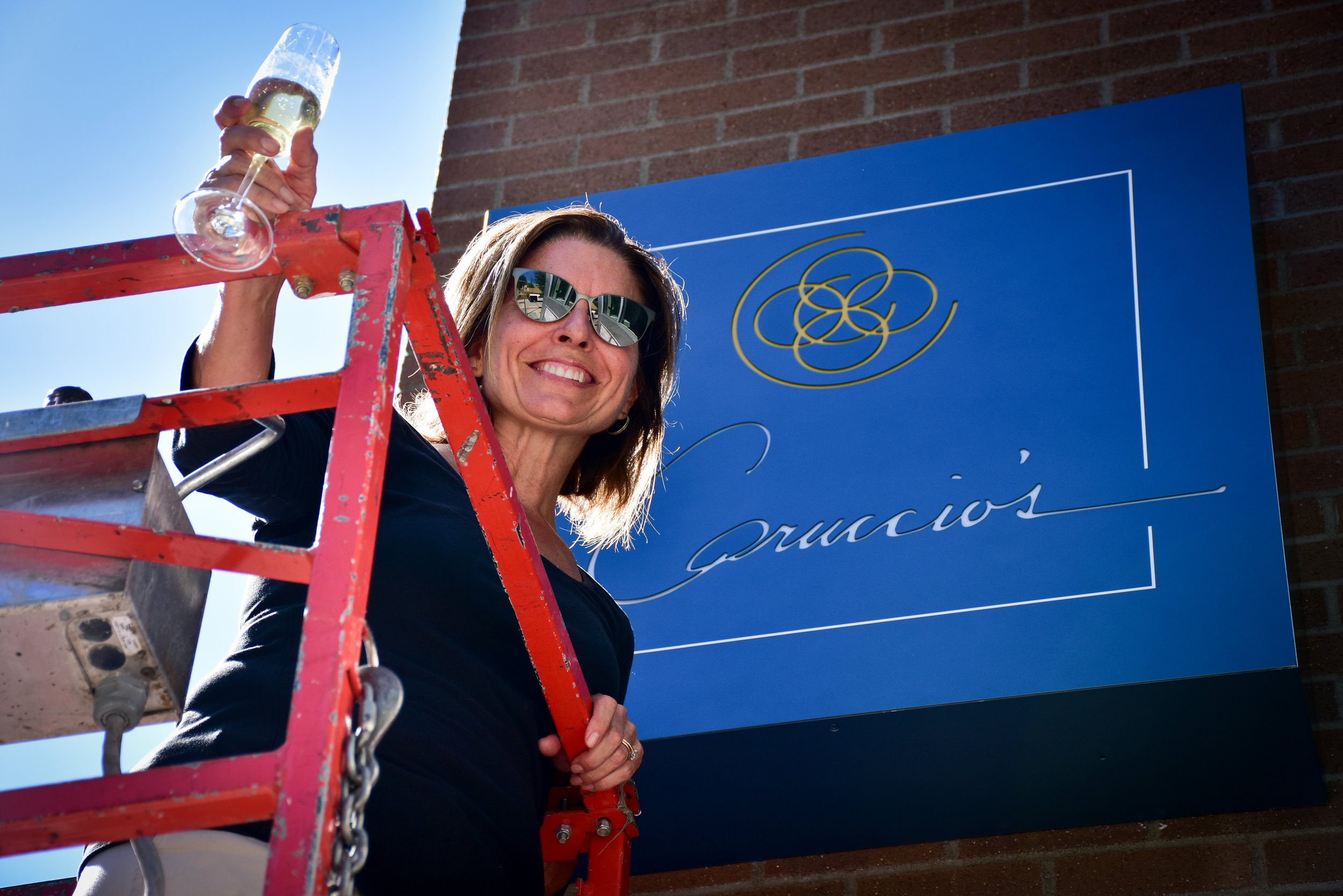
The center of the Caruccio’s logomark is a monogram: a semi-circle with overlapping circles inside, like a stamp. Each element of the monogram is meant to represent a different piece of Caruccio’s tagline, “Learn. Mingle. Share.”
The complete circles inside represent a plate (“Learn”) for all of the cooking demonstrations that will happen in the kitchen. The incomplete circle inside represents a wine glass stain on a table (“Mingle”) for the drinks that will be shared at these events. The overlapping circles represent “Share,” to emphasize how this Culinary Event Center will be a place to share ideas, food, and new experiences. Combined together, this monogram becomes a unique emblem and serves as Caruccio's personal stamp, recognizable and interchangeable with the Caruccio's name.
To add an even more authentic tone to the Caruccio's branding, Lisa used her own signature in the logomark as a way of representing how she takes personal care to sign off on each and every thoughtful detail. While discussing how to pull together the monogram and the signature, Gary suggested placing them inside a square – thus, the logomark in effect represents the physical space of Caruccio’s. If you look closely at the logomark, the structure reflects the actual floor plan of Caruccio’s if you’re looking at it from a bird’s eye view. The monogram in the center represents the beautiful hearth in the center of the space.

The application of the brand identity translated into elegant exterior signage and the design of the website; both serving as a public glimpse into the business. In a collaborative effort with Suzanne, the web design team at Neversink brought Caruccio’s digital branding to life with a beautiful, easy-to-navigate website that flows seamlessly from one section to the next. Everything began to feel very real for Lisa when the backlit sign was placed on the business' storefront and the website was finally launched -- champagne was in order, and it was quite an emotional moment for the owner.
All of the hard work that Suzanne and her team put in has definitely paid off; Lisa said that she loves the branding of Caruccio’s because “We took great care over many meetings, and Suzanne always made sure that all the important elements of me, my business, and my mission are encapsulated in my brand. She always respected and listened to my feedback throughout the process, and I appreciate this!”
To learn more about Caruccio’s and upcoming events, visit the Caruccio’s website.
- - - - -
Caruccio’s Marketing and Branding Team:
Suzanne Zahr, Architect / General Contractor
Laurent Bourscheidt, L+B Design, Creative Director and Graphic Designer
Gary Henderson, Gary Henderson Interiors, Interior Designer
Neversink, Web Design
- - - - -
Written by Julia Hess